The Story Behind My Disgustingly Beautiful New Book Cover
From my 127 reference images to sobbing over the first draft.
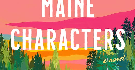
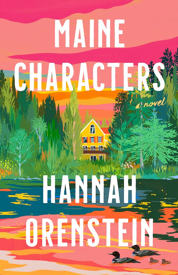
Last week, I revealed the cover for Maine Characters. I am DELIGHTED that so many of you are as obsessed with it as I am. Thank you for cheering it on!
To the readers who have already preordered copies: I love you.
With past books, the cover process was always a journey. (If a picture is worth 1,000 words, imagine how impossible it is to distill 80,000+ words into a single image.)
This time around, it was a cinch, and the result is enormously meaningful to me. Maine Characters has been my most challenging book by far. I love it more than anything I’ve ever written, but it was not easy to get to this point.
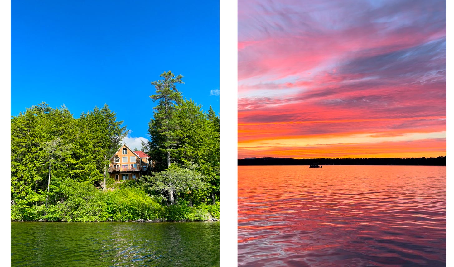
So, to see this world that’s lived in my head and heart for so long as a real, concrete, vivid, beautiful piece of art… that meant everything. And on top of that, the artist wound up painting my family’s actual house, where I wrote the vast majority of the book. Hello??? What!!!
Here’s how it came together.
The inspiration
When I first dreamed up this book in 2020, the cover seemed obvious to me — the setting was inspired by my summers on a lake in Maine, where my favorite thing to do is watch the sun go down over the water. So, a lake sunset, duh.
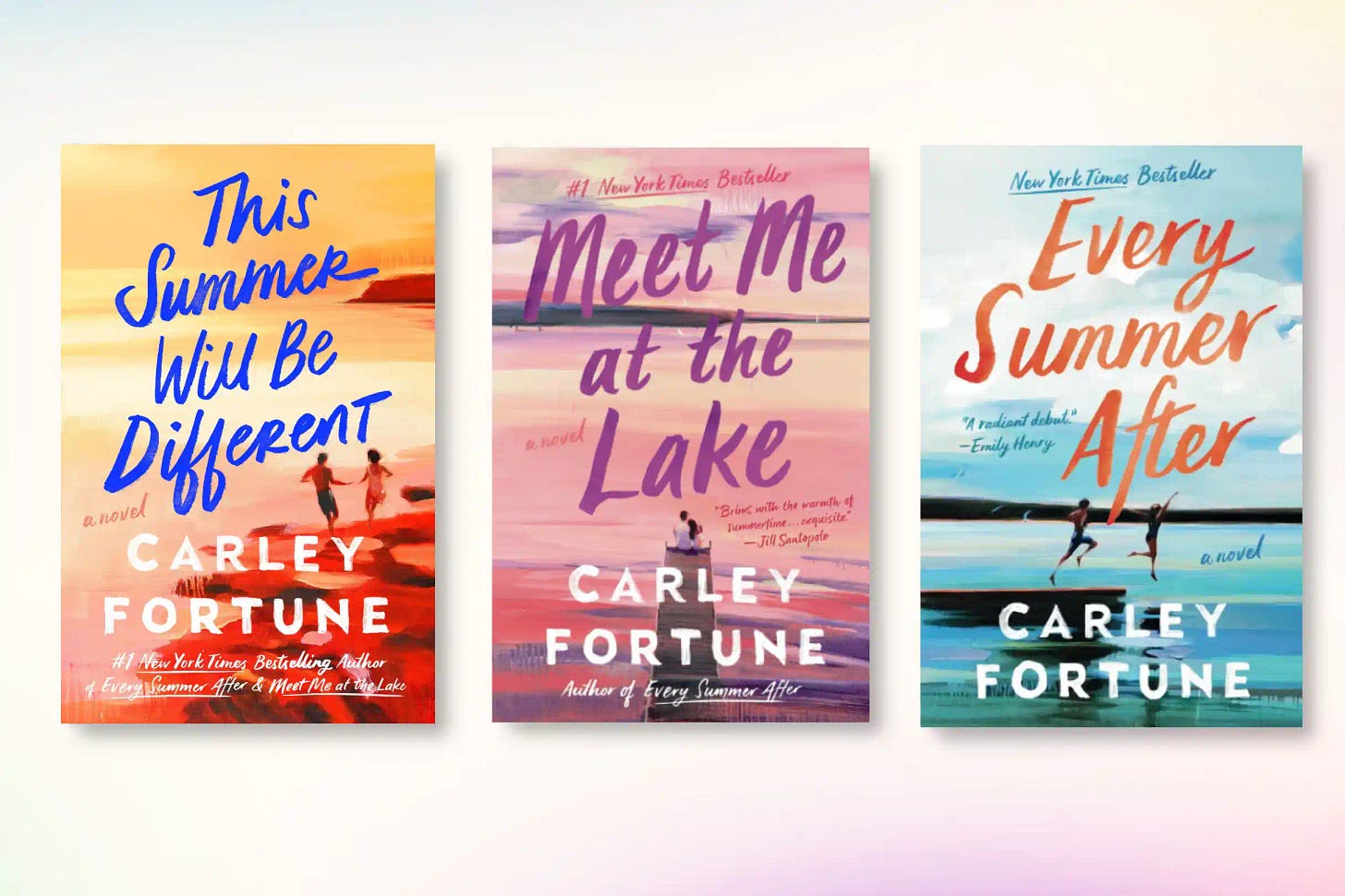
But then in 2022, a little-known book you’ve probably never heard of came out with cover featuring a gorgeous sunset. (Every Summer After by Carley Fortune, a massive New York Times bestseller.) Carley has one stunner after the next, and her name has become synonymous with this kind of imagery.
Carley is, of course, a fellow lake girl. Her dreamiest cover (IMO), Meet Me at the Lake, is literally the view from her house.
So, the question became, how could I capture lake life without doing a bad rip-off of Carley’s covers?
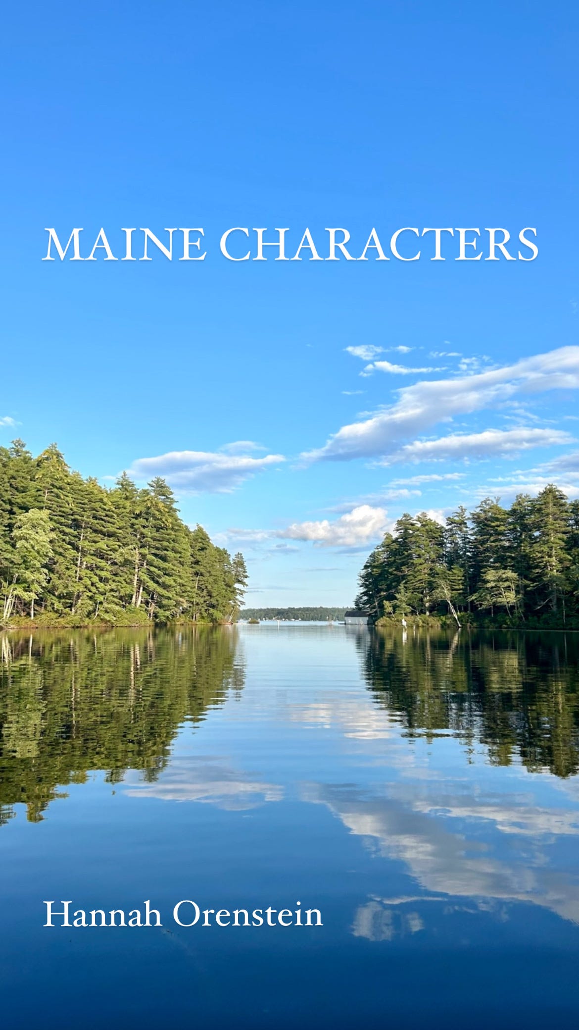
My lake has a little river offshoot, and so for a while, I was imagining an illustrated version of that, like:
The thing is, a lottttt of summer books are blue, and I was worried it wouldn’t stand out.
Enter: Me poring over possibly every book cover published in the contemporary fiction realm over the past five years for inspiration.
I fell in love with Cesca Major’s Maybe Next Time. Evocative! Colorful! I want to climb into this painting and live there! I also liked the idea of putting a lake spin on Jojo Moyes’ graphic, vibrant Still Me.
The wishlist I sent my editor:
A lake with clouds and maybe trees.
Lots of color! Blues, greens, purples, pinks, peaches, oranges, etc.
A painting.
No people. A line of loons might be cute.
Escapist, aspirational.
I put together four ideas for color palettes and polled some friends. I was on the verge of wanting something moodier, but the votes were an even split between just the two on the left.
Including all those — plus a slew of covers I didn’t like (anything that pitted two women against each other) and a smattering of reference photos from the “real” Fox Hill Lake like the ones below — I sent my publisher a very chill, reasonable 127 images for consideration.


Bottom line, I suggested Frankensteining these together:
Which is exactly what I got. Covers always have a lot of cooks in the kitchen (including sales reps and even buyers for major chains), so in no way did I expect it to actually turn out like this.
The next steps
The amazing art team at Dutton (my publisher) showed me three painters for consideration. They were very kind to ask for my opinions throughout the process. There was a unanimous favorite between me, my agent, and people at Dutton: Ariel Lee! She’s an artist from California who mostly does landscapes.
The result
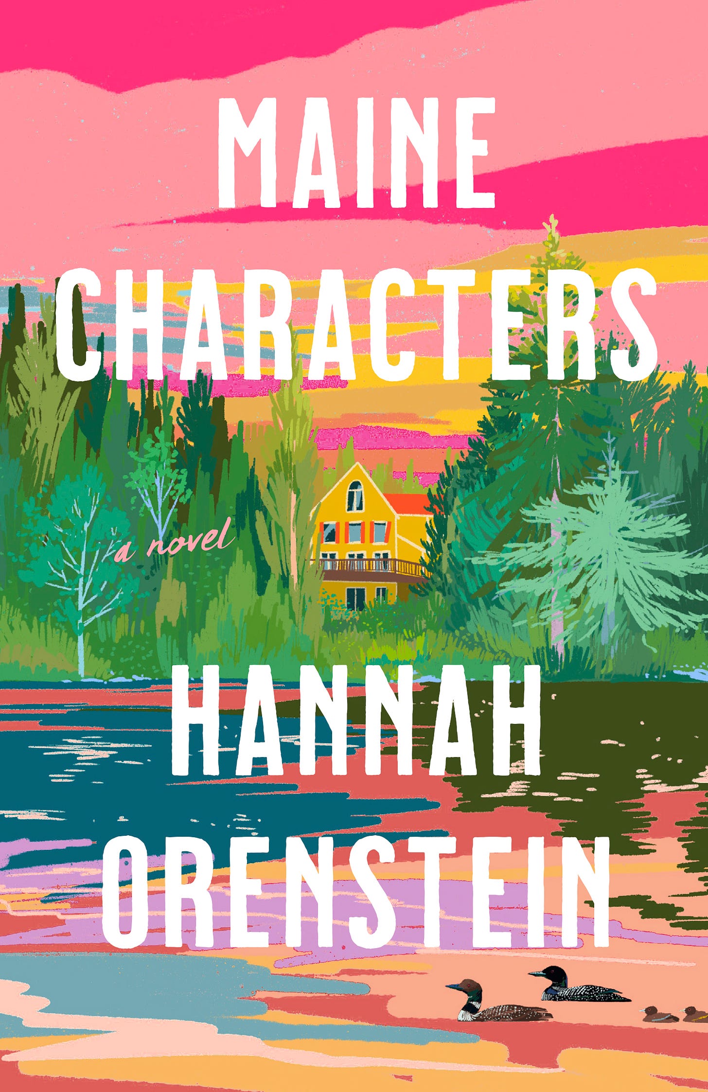
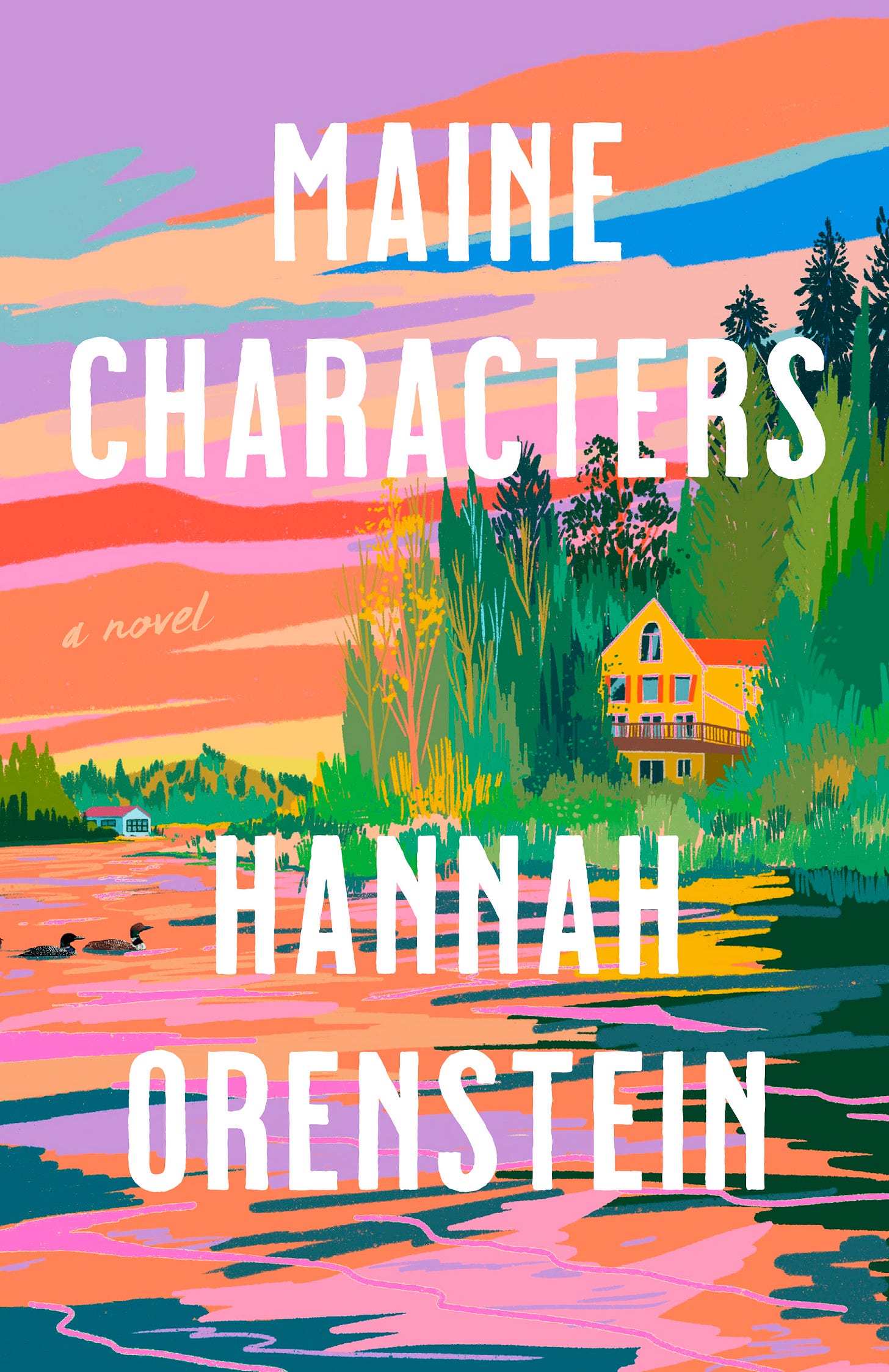
Ariel went off to do her thing! When I saw her two ideas, I burst into tears immediately. “Nailed it” doesn’t even begin to cover it.
These were both presented as sketches, 90% complete with finishing touches to come.
Idea #1:
Idea #2:
My response to my editor and agent:
I've been sobbing happy tears for 20 minutes because they are GORGEOUS. Stunningly beautiful!!! I don't know if an email has ever made me so emotional.
I'm going to sit with this for a few hours if that's okay and get back to you with actual thoughts later today! But my general feedback is: LOVE!!!!!!
Our suggestions for the next draft were to bring some of #2’s colors into #1, simplifying the design behind the type to make it more legible, and adding two baby loons, more trees, a dock, and a boat.
Which turned into:
Based on another round of feedback, she went back to the pink sky, tweaked the colors in the water, added more detail to the trees, and removed the dock and boat (I felt they were distracting). Done!
I’m framing it.
Up next week: A quick guide on how to write a novel. Wish me luck boiling that very simple concept down to a few hundred words.
After that…
See you next Tuesday!
xoxo








This cover is STUNNING!!!! Thanks for taking us behind the scenes- so fun to hear about the process (and one that ends happily!) I can't wait to see it in person.
Love this so much!